Miracle Hills Rebranding
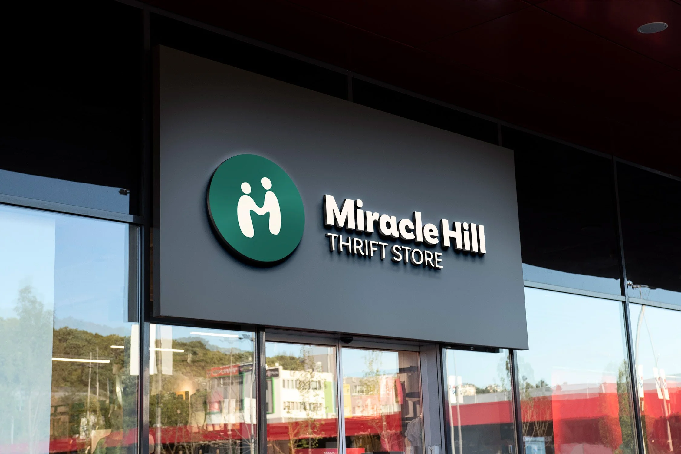
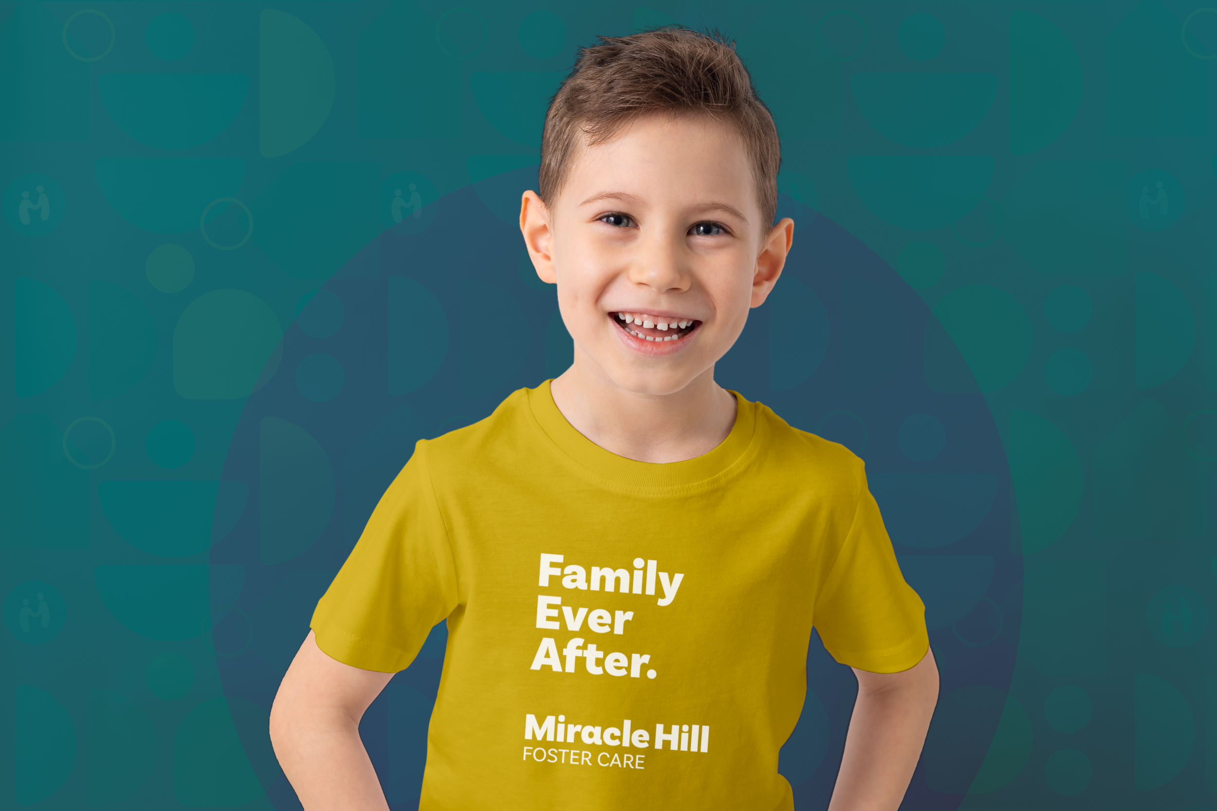
About this Project: After discussing their needs with Miracle Hill, I redesigned their logo while keeping their original two figures, the right helping the left onto his feet. These figures now form the letter “M” for Miracle. Supporting graphics suggest a hilly landscape in cohesion with the company name, Miracle Hills, while also representing the hills and valleys everyone experiences in life.
I designed the logo to be adaptable for use with any of the four services Miracle Hill provides: Homeless Care, Addiction Recovery, Foster Care, and Thrift Store. I chose a color for each ministry to aid with identification and symbolically represent its purpose. Used together for the parent brand, these warm and compassionate colors offer design flexibility to communicate energy, approachability, and trustworthiness.